02 — Financial services and tax
Tally Tax: A Simpler Tax Experience for Young Australians
Most Australians meet the tax system once a year, through an interface built for people who already understand it. Tally reframes the same task as a profile you complete gradually — occupation, employment, income — and uses what it knows to suggest the deductions a person in that situation can usually claim.
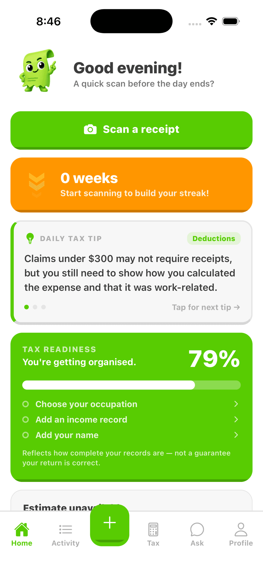
The actual application, exported for the web. Several megabytes, so it only loads if you ask.
Industry
Financial services and tax
Status
App Store submission
Disciplines
Product · Mobile · AI
The problem
- First-time lodgers face an interface written in the language of the tax system rather than the language of their working life.
- People miss deductions they're entitled to simply because nobody tells them the category exists.
- The annual, all-at-once shape of the task makes it easy to defer and stressful to start.
What the work had to achieve
- Replace one intimidating form with a profile that can be filled in over time.
- Surface relevant deductions based on what someone actually does for work.
- Be accurate and careful with the language: helpful without straying into advice it isn't licensed to give.
Our responsibilities
- Product definition and scope
- Product and interface design
- Mobile application development
- AI-assisted deduction suggestions
Decisions that shaped it
01
A profile, not a form
Progress is stored and shown as completion rather than demanded in one sitting. It makes an annual obligation feel resumable, which is the single biggest barrier to starting.
02
Occupation drives everything downstream
Deduction relevance falls out of what someone does for work. Asking that first means later questions can be narrowed to what actually applies to them.
03
Suggestions, never advice
The product suggests categories to consider and is explicit that it isn't a registered tax agent. That boundary shaped the copy throughout, not just the disclaimers.
Brand and interface
- A light, high-contrast interface deliberately unlike the institutional tone of tax software.
- Completion made visible at every level, so progress is legible without opening anything.
- Plain-language labels throughout — 'work and income details' rather than schedule references.
Screens
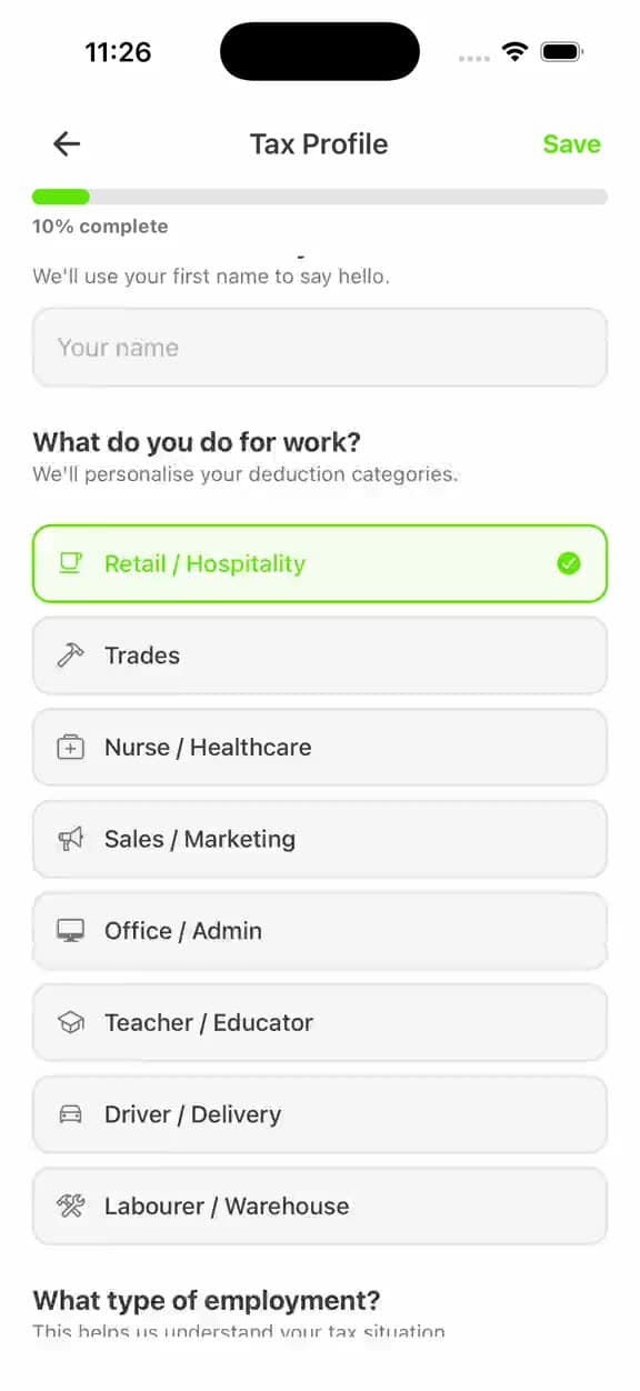
A profile being built: each answer moves the completion bar, which is the whole argument for treating an annual obligation as something resumable.
Readiness is shown as a score with the next three actions under it, so the annual task always has an obvious next step rather than a deadline.
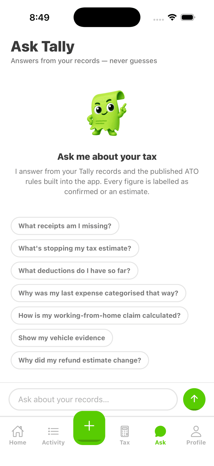
The assistant answers from your own records and the published ATO rules, and labels every figure as confirmed or an estimate — the line between help and advice, drawn in the interface.
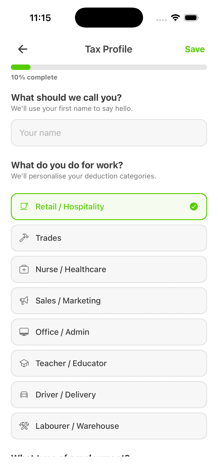
Occupation is asked first because deduction relevance falls out of it — everything downstream can then be narrowed to what actually applies.
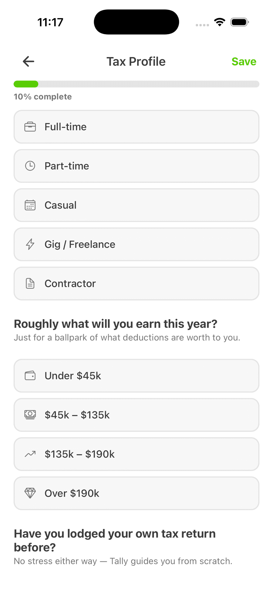
The profile is written as questions a person can answer — “roughly what will you earn this year?” — rather than as the schedule references the tax system uses.
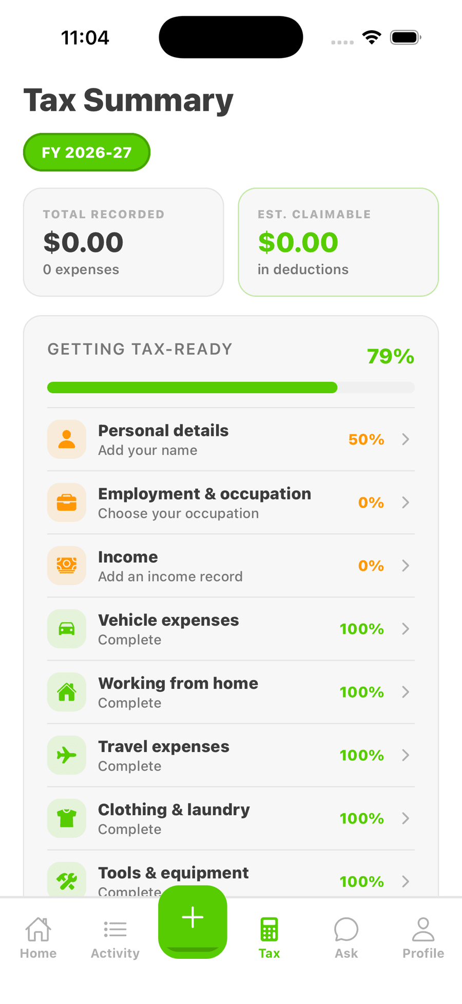
Readiness is tracked per deduction category rather than as one number, so what's missing is always attributable to a specific part of the return.
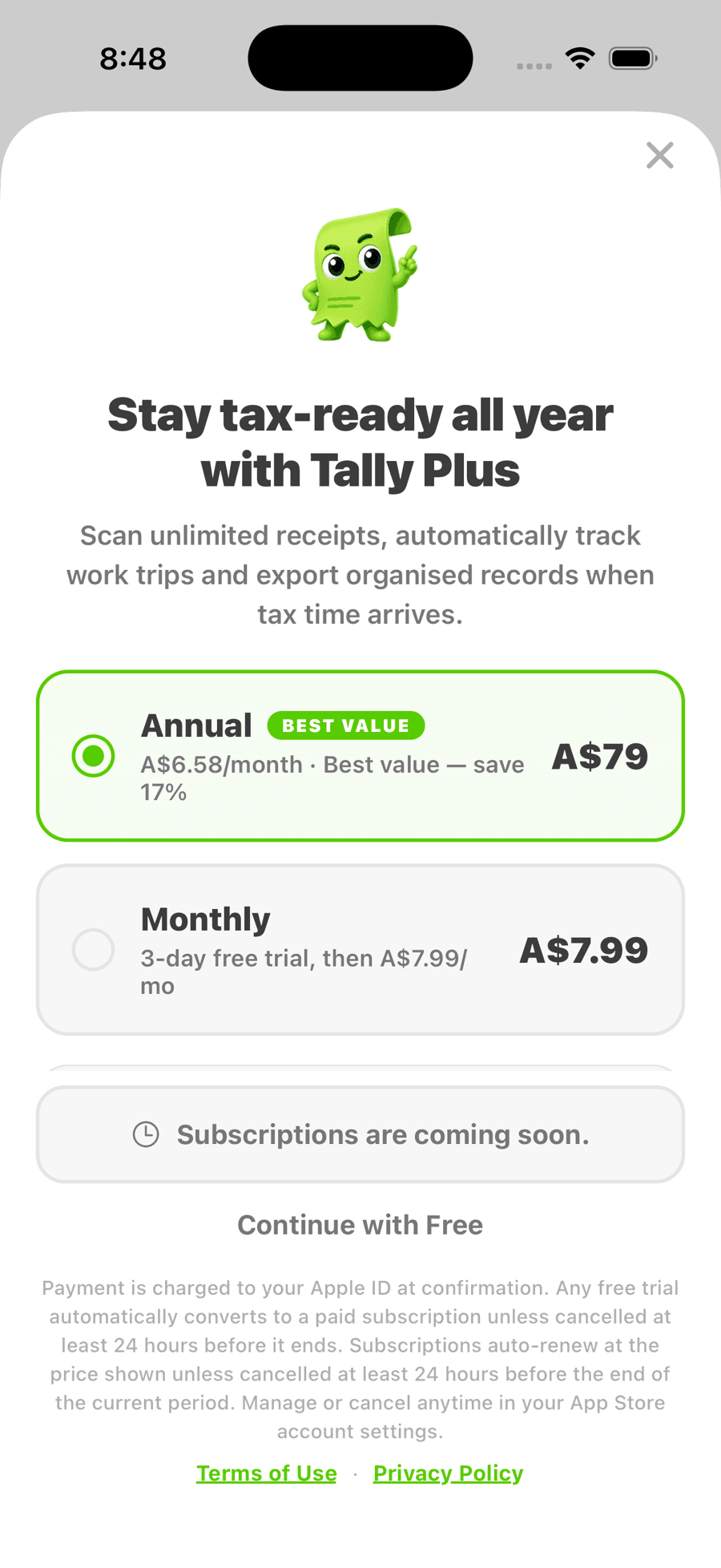
The paid tier is framed around what it removes — unlimited scanning, automatic trip tracking, export — rather than around feature counts.
Engineering approach
- React Native mobile application.
- Structured tax profile model that drives deduction relevance rather than hard-coding categories per screen.
- AI-assisted suggestion layer sitting behind the profile, with output constrained to a reviewed category set.
What we delivered
- Product definition
- Brand and interface design
- Mobile application
- Deduction suggestion system
- Marketing site
New business
Have somethingambitious in mind?
Tell us what you’re building, where you’re currently stuck and what success looks like. You’ll hear directly from Jack within two business days.
Replies come from Jack White.